Yesterday, Microsoft announced that the latest version of Windows, named Windows 10, would be delivered “as a service” rather than as we traditionally think of operating systems. Instead of releaseing new versions every few years, it looks like Microsoft is going to simply upgrade 10, constantly evolving it as technology improves, without the traditional major iterations we are used to.
Even better, for the first year following release, Microsoft has said they will be offering the Windows 10 upgrade for free to users of Windows 7 and Windows 8.
As for what Windows 10 will bring to the table, it seems Microsoft is throwing everything it can into this project – from a new web browser (which seems needless to me considering Internet Explorer has actually gotten quite useful over the last few years) to the Cortana search assistant being available on all devices, to universal applications that will run seamlessly between desktop computers, tablets, phones, and anything else running windows. In the same idea as the Xbox One being and all in one media center, they seem to want Windows 10 to be everything you need in a computer operating system for all devices, which to me, is a wonderful idea.
The thing is, we heard this before, in 2012, with Windows 8. The operating system everyone loves to hate.
Back when Windows 8 was released, it was designed around the idea that you could use the same operating system for both your tablet and your desktop or laptop computer, with Windows Phone getting an update to help solidify this integration. Email accounts, windows and browser settings, and more could sync via a Microsoft account across multiple machines, creating a nearly seamless experience for those who, like me, use a variety of devices.
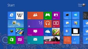
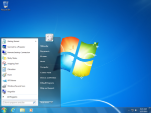
To help with this evolution, Microsoft did something nice – they overhauled the start menu, with its archaic folder setup, with a new method similar to how we operate on the desktop of today, with menu items laid out in a convenient grid. It was far more simple than people thought it was. It worked well, provided quick access to commonly used programs, and the live tiles, while simple, provided at some useful information quickly without needing to open a given application. To me, things were off to a good start.

The Start Screen. The cause of all the Windows 8 fuss. To me, it is the most capable interface Windows has ever had.
The majority of people though, for some reason, hated it, and I never understood why. I have gotten into arguments over this, and no one can ever provide any valid sounding reason for why they hate Windows 8 so much. The only explanations that make sense tend to be business related ones, which I can understand from an infrastructure and administration perspective, but from an end user perspective things only seem to be better with the start screen. The most archaic aspect of Windows was fixed, not replaced. Things were simple, but again, no one else seemed to see it that way.
So, while Microsoft seems to have wanted Windows 8 to be the unified evolution that Windows 10 is becoming, it failed to impress the masses. It seems that they have pooled their resources into “fixing” the start menu / start screen debacle, while moving forward with their vision for what Windows 8 should have been.
Granted, there were minor flaws abound in the general design of Windows 8, but I felt they were nothing that 5 to 10 minutes of usage wouldn’t fix. People are willing to learn how their shiny new smartphone works, why not one relatively simple change to what is otherwise the same Windows operating system they already know and love?
It never made sense to me, and never will. To me, Windows 8 will always be a wonderful idea that the world, for whatever reason, just wasn’t ready for. It seems I think better of people than they give themselves credit for, and it’s sad to see things like this happen, but that’s what happens.
I look forward to Windows 10. While I have downloaded the beta ISO’s, I never have installed them, due to time and interest. When 10 is released, I certainly will upgrade, but I am hoping somewhere deep down, I can re-enable the Windows 8 start screen experience. I for one found it incredibly useful, and I can hope in the future others will as well, much like how the Windows XP start menu became more beloved than the “classic” menu.


I think it’s a great news, as they gonna stop to flood the market with “super release” that we haven’t time to try on half before going to next gen… This philosophy should make Microsoft win the OS more than ever before as, fidelity was the thing that were missing in their marketing aspect… Now they finally find a solution, i’m happy with this change of approach!
I agree. This is a much better way all around for Microsoft to manage Windows!