On July 29th, 2015, Microsoft will release Windows 10, the successor to Windows 8. Windows 10 will bring more improvements to the continually evolving Windows Operating System. This releases is being met with praise from both common users and tech-heads alike for numerous upgrades and improvements over previous Windows releases. Namely, over it’s predecessor, Windows 8.
As I am certain anyone reading this will know, Windows 8 has been met with mixed, if not negative, reviews. For the past 2 and a half years, I have heard seemingly nonstop complaints about the operating system, virtually all of them stemming from the “metro” interface and elements directly related to this interface.
While criticism is valid opinion; I don’t expect everyone to enjoy such a major overhaul, my experience with the operating system has been quite different from the norm. I simply have not experienced the issues other have, for the most part; if I have had those troubles, however, I quickly adapted and moved on with my computer usage with that much more skill with the then new operating system.
I in no way hide that I actually am one of those people who absolutely loves Windows 8. That being said, I’m not above saying what I find wrong with it, but I’m not going to complain about something I don’t see as a flaw. In early 2012, I downloaded the public beta releases of Windows 8 and was originally very unimpressed with what I experienced. I couldn’t figure the operating system out, which was irritating, as one would expect. However, with minimal effort, I learned the nuances of this new interface, and quickly grew to love it. My workflow actually improved, and I felt more in control of my machine than ever before. I actually detailed this time period in this article.
On launch day, I went to a local Best Buy and purchased a Windows 8 upgrade for my main machine. This was not the same machine I tested on, but instead, my day-to-day HP computer. This was, in a way, the real test of the operating system – actual usage on my main day to day machine.
The transition was seamless, and Windows 8 made my, at the time, 3 year old computer feel new again, and for a computer owner, there is arguably no greater feeling. Comments on the internet, however, seemed to be very far from my own experience. I discussed my thoughts on those reactions in this article.
Now, I’m not saying every complaint about Windows 8 was without warrant – there were many design nuances that should have been tweaked in the final product, and Microsoft saw this. In Fall of 2013, just under a year after the initial release of Windows 8, Microsoft released an update to the operating system, known as Windows 8.1. I covered Windows 8.1 in this article, where I addressed what was promoted in it’s preview video.
This still wasn’t enough. In the past few years, I have continued to hear the same constant complaints about Windows 8, which at this stage just seems ridiculous. At this point, I feel like addressing the major criticisms that I have noticed continually being stated; I’m going to share my comments on the criticisms, and let that be that. I doubt I will cover all criticisms here, but I’ll do what I can to address the most common ones I made note of.
I miss the Start Menu / Criticisms on the Start Screen
The most common complaint is people missing the Start Menu, but no one goes into detail on what exactly the issue is – as such, I will address what nuanced complaints I have actually seen.
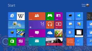
The Start Screen exists as a means to start various applications on the machine, as well as have quick access to various information from “metro” apps.
To me, the Start Screen functions as a more advanced form of the classic desktop – in traditional Windows usage, users would always add shortcuts to commonly used software to the desktop, allowing speedy launching of such. Of course, the desktop only has so much space – the Start Screen would scroll to accommodate more tiles than could be shown on one screen. It’s like a master list of major applications on your machine – you could customize the position and groupings of the app tiles for easy access and locating. I felt in control with it.
Additionally, as I mentioned before, there was the “at a glance” access to information from apps which took advantage of these live tiles. There were attempts in Windows Vista and Windows 7 to add real-time information updates to the desktop, and those elements evolved into the live tiles of Windows 8. Quick access to information without having to run a program; sounds good to me. Granted, this has only proven useful to me for a great few apps, it is still a nice option to have.
My opposition to the Start Menu has always been it’s speed – it’s an extremely slow, outdated way to access a shortcut. In the old Start Menu, you could of course pin application shortcuts, but only maybe a few before you ran out of space – By comparison again, the Start Screen allowed you to pin any number of applications you might want quick access too.
The other method of accessing applications via the Start Menu was a long, drawn out process of sorting through folder after folder to get to the program shortcut. By contrast, on the Start Screen, shortcuts of newly installed programs would be added to the tail end of the list, meaning nothing more than a quick scroll on the screen to get to that new, or rarely used program.
You tell me which method is faster to get to the end result – running your chosen piece of software? People act as if something was taken away, when, I feel, in reality nothing was – The whole point of the Start Menu was to allow you to start applications. The Start Screen lets you do that, even more quickly than before.
There are certain power users who have mentioned special exploits that could be done with the Start Menu of Windows XP, but these are, again, power user tricks, which also don’t work in Windows 7 and probably will not work in Windows 10, so they add nothing to this subject beyond an interesting note of how an older Windows release works.
One final note is that, especially with the addition of boot to desktop in Windows 8.1, you virtually never actually have to use the Start Screen. You can do all your work without ever once accessing the Start Screen, unless you choose to, or your work needs modern apps; under normal usage, no situation should ever come up that requires a user to access Start in any capacity.
I could go on and on about this one issue, but I think I have made my points here. I don’t understand the need for the Start Menu at all, and I personally can barely stand the thing.
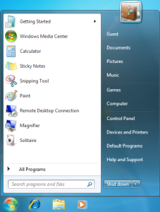
The Windows 7 Start Menu. Note the pinned apps.
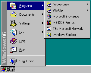
The Windows 95 Start Menu.
It’s touch only /you can’t use it with a keyboard and mouse
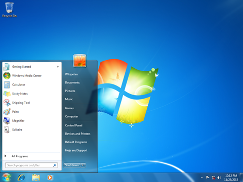
The Windows 7 Desktop and Start Menu. Note the limited space – what you see is what you get.
This is probably the second most common complaint type I see, that Windows 8 isn’t good for a normal computer.
If this was true, how is it that I have had such a good time using the OS with my keyboard and mouse?
Windows 8 was designed to be touch centered but not touch focused, and yes, there is a difference between the two. The general design of computer operating systems is based on keyboard and mouse inputs, which work find in their own world, but do not translate well into touch based devices. With Windows 8, Microsoft was building an operating system that could be used on all types of devices – normal computers, touch screen PC’s, tablets, and other portable devices. This is the reason for the size of the live tiles on the start screen, and the gestures (more on those later) which are used to interact with various new elements of the operating system.
The thing is, there are no actions that involve touch that are not also possible to preform using a keyboard and mouse – there are keyboard shortcuts for most every major action or menu gesture, and the mouse can also be used to invoke touch based gestures.
Explain to me how having access to every feature available via keyboard and mouse as well as touch is an operating system being “touch based” or “touch focused”. It’s only centered on touch being a way to interface, and supports such by design – using it on my touch based laptop is an amazing experience – to allow people more options on how to use the software, and their devices.
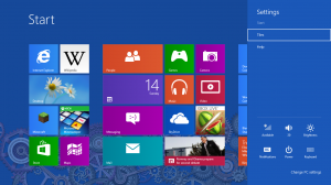
The settings menu, which also includes how to shut down the computer.
Gestures / I don’t know how to do this, that, the other
Windows 8, being touch centered, did feature quite a few new ways of interacting. The most noticeable elements were that, hidden on the sides of the screen display were areas that if swiped in from beyond the display, various actions would happen – special menu’s, app switching and closing; pretty standard features.
I won’t lie – these things are hidden, so a first time user could have issues finding these features, or figuring out how to use them. The thing is, these features are documented – windows let’s first time users know of these, and while one major feature – system shutdown – is hidden in one of these menus (the charms menu, to be specific), a power option was added to the Start Screen to make it easy for users who had trouble with this menu to shut down their machines.
As mentioned before, these features are accessible via keyboard shortcuts and mouse actions. One of the largest complaints about Windows 8 gestures, beyond shutdown, was how to close “metro” apps – the new “modern” windows applications that behaved more like cell phone or table apps than a traditional desktop application. The idea behind such apps is that the user will swipe down from the top of the screen, pulling the app down to close it. Such works amazingly well, and is a feature I wish was standard on other tablets – it feels extremely natural on a touch screen.
Of course this is possible to do with a mouse as well. Granted, like the other swipe gestures, this isn’t something you could easily figure out on your own – I didn’t know how to do it originally, but once I learned how, I didn’t forget. It’s trivial to do with a mouse, or trackpad. Of course, if someone has trouble doing even this, there is another way to close the app: alt+ F4. A close app combination that has existed in Windows for probably 20 years now, dating back to at least Windows 95, if not older.
A very standard, and very old, way to close any program on Windows.
Final Comments and Thoughts
I have had minimal issues with Windows 8. On a whole, I feel it was an incredible upgrade to Windows 7, and while it seems to have failed to impress the masses, I can see exactly what Microsoft was doing with the design, and I learned to appreciate that.
Indeed, that’s the key thing hear – learning. Whenever people are exposed to something new, they will have to learn how this new thing works. It takes time to adjust to something new, but if a person keeps at it, they will learn everything they need to.
The fact that Windows 8 was designed with the mobile market in mind makes an interesting comparison here – people will spend the time to learn their new cell phones, which behave completely different from any other computer they used, but they won’t spend the 5 minutes to learn how to operate Windows 8. They will instead complain time and time again, and blame the operating system for their own inability to learn something new.
Nothing was taken away – elements were added. Windows 8 was still Windows. You still do most of your work on a normal desktop, using normal desktop apps. Games work fine, productivity applications work fine, all with many improvements on a whole that most users would never notice, but they are there.
Now, I’m not saying every person complaining about Windows 8 fits this description, but I feel the majority of complaints are unwarranted – many of them are probably nothing more than a trend of hating on things because it is popular to.
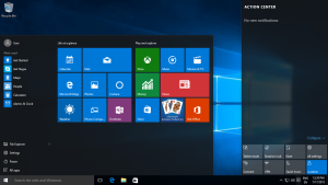
Windows 10 will mark a return to the Start Menu. There will be additional improvements to modern apps, and other adjustments marking an evolution from Windows 8. I am looking forward to Windows 10, but I am also waiting for the unwarranted compliments to come – inevitably, many elements of Windows 8 will be praised in Windows 10 as if they were new features to that operating system. Unwarranted credit is one of those things that annoys me, but what can I do?I was one of the few people who understood Windows 8. I am one of the few people who learned how to take advantage of the new features, to help me use my computer the way I wanted to.If you have any comments, I don’t care. Don’t come to me whining about Windows 8, and what you think was bad about it – I don’t care. The odds are high any complaint you could ever make will still fall under the above comments. I’m tired of hearing it; I just don’t get everyone’s hate, and I never will.Thank you for reading, and here’s looking towards Windows 10.
RELATED READING:
https://en.wikipedia.org/wiki/Windows_7
https://en.wikipedia.org/wiki/Start_menu
https://en.wikipedia.org/wiki/Windows_8
https://en.wikipedia.org/wiki/Windows_10
