When I go on YouTube to watch a video, I expect it to just work. More precisely, I expect the fundamentals to work as they should – I’m able to log in, watch the videos I want to, and go about my day enjoying content. The subscription listing is key to this, since those content creators you subscribe to are the ones you want to see things from first. This content being listed in an easy to digest way is not just something to be expected, but mandatory. YouTube wants you to watch content, right? Make it where a person wants to hunt for content.
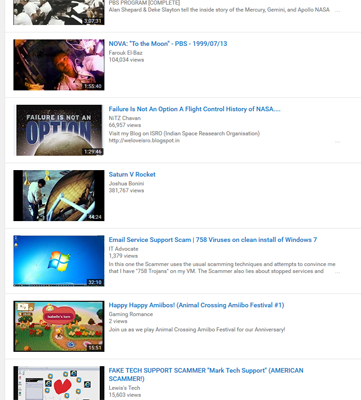
That being said, the normal “list” method of showing subscriptions was perfect. Videos listed in a single column, in order of upload. Easy! Concise. It worked fine, until today.
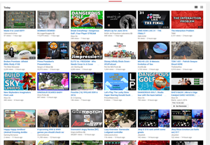
Today, when logging in to begin video watching, everything in my subscription listing came in the, to me, horrible “grid” view. Grid is good for individual channels, but not for the subscriptions listing, to me, since it’s more of a clustered mess. For finding new videos, sure, but for the content you want to see, it being listed one after another just works better for me.

The grid view is just a disorganized mess to me.
Now, this wouldn’t be so bad, if it wasn’t for the fact that attempting to click on the “list” view simply doesn’t work. Oh, sure, the option “?flow=2” gets added to the URL, but otherwise, it doesn’t work. At least for me… and some other friends.
Yep. It seems I’m not the only person with this issue right now.
Here’s the thing… is this a bug? Is this intentional? Are they forcing another needless change on us, or did someone just break something yet again for another needless addition.

The list view is so much more clean, and better for more refined video listings.
YouTube has a track record of this, breaking features and never quite fixing them, replacing them with lesser versions of themselves, and otherwise wasting time on “new” features that aren’t worth a damn when the core system is broken.
I know this may seem minor, but it’s an incredible annoyance when you just want to check on the subscription stream – you get used to it being one way, and it being forced into the other, messier format is, well, stupid. People generally don’t like change, and sure as hell don’t like having options removed. I’ve tried grid view for subscriptions. I don’t like it. Don’t fucking force it on me.
A funny side note is that I made a video for my own channel, where I complained about this happening. When trying to upload it, YouTube repeatedly gave me errors – only when trying to upload something else did the upload “magically” work. I’m not saying they were trying to censor me (as the video has a harsh anti-YouTube title) but I wouldn’t be surprised. I don’t trust Google as far as I could throw one of their servers…
Update
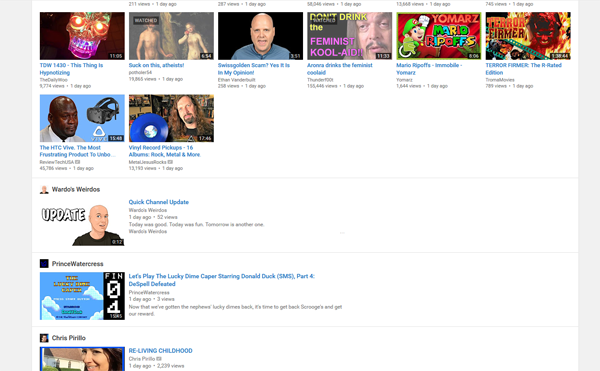
So, my buddy Prince Watercress reported to me that if you scroll down, the list fixes back to normal sort.
I tried it, and it does.
Clearly Google COMPLETELY messed up on this. As they always do…

Seriously, what the hell is this?
